Monitor calibration is one of those photography tasks that sounds tedious until the first time you print an image and it comes out twenty percent darker than what you saw on screen. After that, you tend to take it seriously. The good news is that getting your monitor properly calibrated isn’t actually that hard, and once you have done it you don’t have to think about it again for a month or two.
Table of Contents:
Quick Verdict
If you edit photos seriously, get a hardware colorimeter. Your operating system’s built-in calibration relies on your eyes, and your eyes adapt to ambient light, so software-only calibration is roughly as accurate as a guess. If you don’t edit seriously, or if you only share photos to the web, software calibration will do the job.
For a hardware tool, in 2026 the photographer picks are the Datacolor SpyderPro or the Calibrite ColorChecker Display Pro. If your monitor is HDR-capable (and a lot of new monitors are), step up to the Datacolor SpyderPro or the Calibrite Display Pro HL, which handle high-luminance displays properly. I am still using my original Datacolor Spyder X Pro (which the older Datacolor product line is usually shortened to “SpyderX”) from when I first wrote this guide. If I were buying today, I would get the SpyderPro, which is the current top of the Datacolor line.
Do You Actually Need to Calibrate?
Before you spend money on a colorimeter, ask yourself a few questions. Some of these have answers that don’t involve calibration at all.
- Are you printing your photos? If yes, calibration matters a lot. Print is where on-screen and physical output diverge most visibly. If no, you can probably get by with software calibration plus a sensible monitor.
- Are clients reporting that your photos look different on their end? Often the answer is “their monitor is set up badly” and there is nothing you can do about it. But if multiple clients are saying the same thing, the problem might be on your end.
- Do colours shift between your laptop screen and your external monitor? If yes, you don’t necessarily need a colorimeter. You need to calibrate the laptop and the external display to match, which a colorimeter can do, but a careful software pass on both can get you most of the way there.
- Is your screen brightness set above 60%? If yes, your prints will probably come out darker than you expect, calibrated or not. Lower the brightness. The photography industry standard for print work is 120 cd/m², which is pretty dim. A lot of “my prints are wrong” problems are really “my monitor is set too bright” problems.
- Are you editing in a room with a big window behind you, or under coloured lighting? Calibration won’t fix that. Either move, fit a curtain, or change the lights. Ambient light has a bigger effect on perceived colour than any software setting.
- Have you actually run your operating system’s built-in calibration tool? If you haven’t, do that first. It takes ten minutes and is free. You’ll then have a much better idea of whether a hardware tool is worth it.
If you answered yes to most of the printing and client-feedback questions, get a colorimeter. If you answered yes mainly to the brightness and ambient-light questions, fix those first.
Best Monitor Calibrators in 2026
The colorimeter market has two main players for photographers: Datacolor (the Spyder line) and Calibrite (formerly X-Rite ColorChecker, spun out as a separate company). Both make solid devices. Both have updated their product lines in 2024 and 2025 to handle OLED, QD-OLED, mini-LED, and HDR-capable displays, which the older generation of colorimeters did not.
Here is how the current photographer-relevant picks compare:
| Model | Photographer fit | Luminance ceiling | OLED | Multi-monitor | Tier |
|---|---|---|---|---|---|
| Datacolor Spyder | Hobbyist / part-time | Up to 3,000 cd/m² | Yes (including QD-OLED) | Unlimited | Mid |
| Datacolor SpyderPro | Working photographer, multi-monitor setups | Up to 12,000 cd/m² | Yes (including QD-OLED, Apple XDR) | Unlimited | Premium |
| Calibrite ColorChecker Display Pro | Working photographer, SDR mainstay | Around 1,000 cd/m² | Yes | Up to 4 displays | Mid |
| Calibrite Display Pro HL | HDR-capable monitor, high-luminance work | Up to 3,000 cd/m² | Yes | Yes | Premium |
Which one should you buy?
A few decision pivots:
- If your monitor is HDR-capable or you do any HDR editing (Lightroom now has a working HDR workflow, and a lot of new monitors support HDR), get the Datacolor SpyderPro or the Calibrite Display Pro HL. Older non-HL colorimeters don’t read high-luminance displays accurately above their measurement ceiling, which means your HDR calibration would just be wrong.
- If you have multiple monitors and want them matched, the Datacolor SpyderPro’s StudioMatch feature is purpose-built for this, and there is no display limit. The mid Datacolor Spyder caps at three displays.
- If you want a single budget-friendly photographer pick for an SDR monitor, either the Datacolor Spyder or the Calibrite ColorChecker Display Pro will do the job. They are roughly equivalent for general photography use.
- If you want the “buy and forget about it” pick, get the SpyderPro. It does everything, supports any current display technology, and will keep working as you upgrade monitors over the next decade.
I have been using my original Datacolor Spyder X Pro since around 2020. It still works, the calibration profiles it produces still look ok, and Datacolor’s software keeps it supported. But the older Spyder X Pro does not handle OLED or HDR displays well, and as my current monitor is one of those, I could do with an upgrade. The SpyderPro will be the one I purchase.
I haven’t personally used the Calibrite range. From what working photographers I know report, the Calibrite ColorChecker Display Pro is the closest equivalent to the Datacolor Spyder in everyday use, and the Pro HL is the closest equivalent to the SpyderPro for HDR monitors. The two brands trade blows on features release by release; either is a reasonable pick.
If you want a deeper write-up of the calibration process with a real colorimeter, scroll down to the Hardware Monitor Calibration section below, which walks through what an actual calibration session looks like (with photos of my Spyder X Pro in use).
What is Colour Management and Monitor Calibration?
Let’s first look at what colour management and calibration actually are.
Your monitor or screen has some controls that let you change how it looks. This applies to any of your devices, whether it’s your desktop monitor, laptop screen, smartphone, tablet, or external monitor.
The controls vary depending on the screen, but in general they let you adjust the brightness of the screen and often other things like saturation and contrast. The controls on an external monitor are usually similar to those on a TV, and are accessed via a button on the back or side. You’ll know that changing brightness, contrast and colour on a TV changes how the image looks. It’s the same on a computer monitor, and to some extent, other device screens.
There are also other ways you can control how your screen looks. These settings are normally configured through the operating system on your device, whether that is Windows, macOS, iOS, Android, or Linux. Adjusting these settings is what we call colour management. Basically, you are adjusting how different colours appear on your screen.
The operating system reads the colour management setup on your computer, and instructs the graphics chip to send specific instructions to the display. The display then renders the colours, adjusting the saturation, intensity, and brightness accordingly.
Calibrating your monitor and colour management are two tasks that go hand in hand, and the terms are often used interchangeably. The end goal is the same: get your monitor to accurately display colours.
Why Do You Need To Calibrate Your Display?
The main reason is consistency. Think of a photo for a moment. If a monitor is correctly calibrated, when you look at the photo you took on the screen, it should match fairly closely to what the scene looked like when you took it.
Once you edit the photo, of course it will look different from the original, depending on the adjustments you make. However, when you come to share your image, either digitally or physically, you want to be sure that what other people see matches the image on your screen.
If you plan on printing your images, then having a correctly calibrated monitor matters a lot, so you know that the printed image will look as it does on your screen. It can be very disappointing to spend time editing an image and find out that the printed result doesn’t match what you see.
If you are selling your photos, perhaps as a wedding photographer, landscape photographer or event photographer, having print images that match how they look on screen is critical. The person buying the shot will want what they buy to match your vision.
For sharing to the web, colour management is still important, although perhaps not so much. You can’t control other people’s screens. If your screen is set up correctly, but someone else has their saturation set high, your image will appear more saturated to them. All you can do is configure things correctly on your end. If someone else has an incorrectly configured display, that is up to them to fix.
If you correctly configure your display or displays, then your image should look the same on all of them, and when you print it, it will also look the same.
For a lot of people this may not be very important. If you are a hobbyist photographer or blogger who mainly shares photos online, you may not care very much. But if you print a lot of photos or if you want to sell your photos, then monitor calibration and colour management are much more important.
I would still say that if you plan to get serious about your photography, starting out with a properly calibrated monitor is a good idea.
Colour Management Terminology
Before going into the details of how to calibrate your screen, I want to cover some terminology you will encounter in display technology and colour management.
I will try not to get too bogged down in the nitty gritty, but it’s important to at least have a high level idea of some of these concepts if you want to understand how colour calibration works.
If you just want to get on with calibrating your monitor, you can of course skip down to that part of the post.
Colour Space
The first thing we’re going to cover is the idea of a colour space.
A colour space is a way to order and define colours, across a variety of applications. For example, a commonly known colour space in many industries is the Pantone Color Matching System. This has a huge number of standardised colours, each of which has an individual number.
A system like this means that different manufacturers can create products entirely separately from each other, and know that if they pick the same Pantone colour, the final products will match. The Pantone system is commonly used by fashion designers, cosmetics companies, interior designers, graphic designers, and paint companies.
In the world of display technology, modern displays use a colour space based on the RGB colour model. A colour model is simply a means of describing how a colour is made.
RGB stands for Red Green Blue, and this indicates that every colour displayed on a screen is made up of these three colours in varying intensities. It’s what is known as an additive colour model, because these three colours are added together to make the final colour.
If you looked very closely at your display, you would see that it’s made up of pixels. Each pixel is composed of three little coloured lights, a red light, a green light, and a blue light. These lights are referred to as channels.
To define each colour a screen can display, a number between 0 and 255 is assigned to each of these three channels. 0 means none of that colour, 255 means all of that colour. For example, red is denoted as RGB (255, 0, 0). This means to show this colour, the monitor must show 100% of the red light, and 0% of the green and blue light.
White combines all three colours, RGB (255, 255, 255), and at the other end of the spectrum you get black by the complete absence of all three, RGB (0, 0, 0).
Between black and white, and using the RGB system, a monitor can display over 16 million colours. This is because each colour it creates can be represented by up to 256 intensities of red, green and blue. If you multiply each of these together, 256*256*256, you end up with over 16 million possible colour combinations. Here are some examples:
So RGB is a colour model. Let’s get back to colour spaces. In the world of display technology there are a number of colour spaces based upon the RGB colour model which are commonly in use. The most common are the sRGB colour space, the Adobe RGB colour space, and increasingly Display P3 (Apple’s wide-gamut standard, used on most modern Macs and iPhones). The default colour space that the majority of devices in the world use is sRGB.
These colour spaces use the same underlying concept, in that each possible colour they are able to display is made up of red, green, and blue and each of those is available on a scale from 0 to 255.
However, Adobe RGB spreads the colour space out more than sRGB. As a result, it can display a wider range of colours. This range is known as the colour gamut, which we will cover in the next section. Display P3 sits between sRGB and Adobe RGB in coverage, but pushes further into the greens and reds than sRGB does.
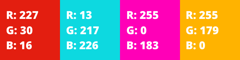
What this means in practice is that the same RGB values produce a different colour in sRGB compared to Adobe RGB. So for example, RGB (227, 30, 16) refers to a different colour in sRGB compared to Adobe RGB. This is why it’s so important to know the colour space, as it directly affects the final colours that are displayed on the monitor, as it is converting all these numbers into actual colours on the screen.
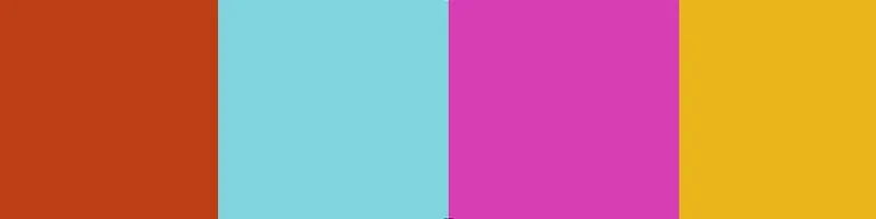
Taking the above image as an example, if this is saved as an Adobe RGB image, but viewed incorrectly as an sRGB image, it might look as follows.
Let’s look at another example to show the difference.
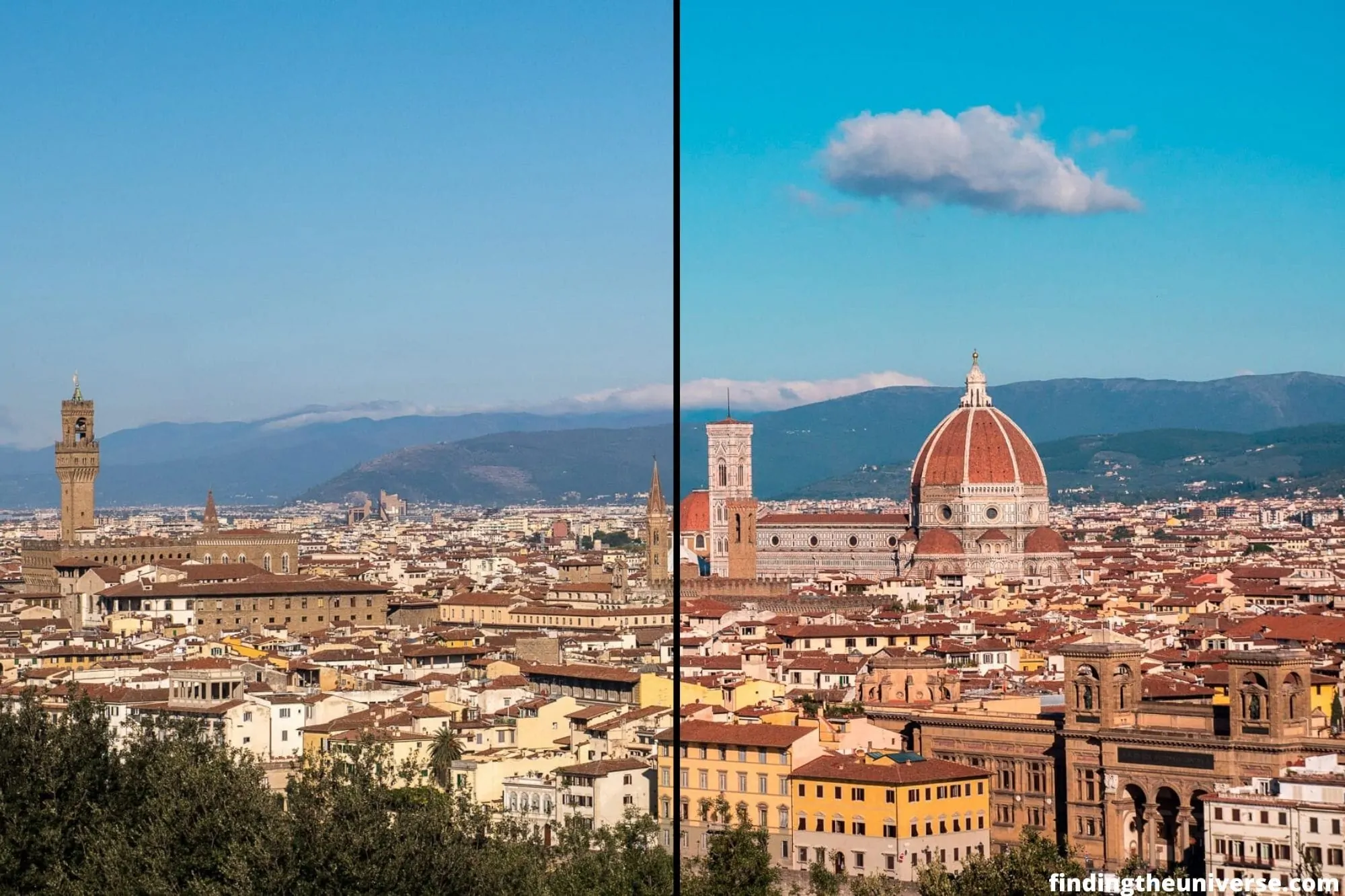
The above image is two halves of the same image, to demonstrate how colours can change when there’s a mismatch between profiles. You can see in the left hand side of the image above that the sky is much less saturated, and the red and yellows are more muted. This commonly happens when an AdobeRGB image (on the left) is loaded into an application that is expecting an sRGB image (on the right).
This is because the browser is reading the AdobeRGB colours in the image, each one represented by codes like RGB (123, 130, 101), but actually displaying them as sRGB colours.
It’s important to know what colour space you are working in, and what colour space you are targeting. If you are using a wide gamut monitor, you will likely be working in Adobe RGB, or another wide gamut colour space.
For print, you will likely save your images in Adobe RGB, although your print shop will likely tell you what profile they work with. If you are sharing your photos to the web, you will want to convert them to sRGB for the greatest compatibility.
If you don’t have a wide gamut monitor, you will be working in sRGB, and saving your photos in sRGB.
This all should work fine, as you can convert images between colour profiles. The issues start to arise if you save an image in one colour profile, but they are opened as another. This is when you start to see mismatches like the image above.
Gamut
In colour, a gamut indicates the width of colours that a colour space contains. We will be using sRGB and Adobe RGB for comparison here. Both are based on the RGB colour model, so they both have the capability to display around 16 million colours, with 256 values available for each of the three colours.
However, these colours are spread out differently with the two colour spaces. Let’s look at a couple of diagrams to demonstrate this.
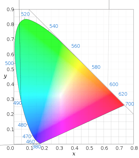
The above diagram approximately shows all the colours that the human eye can see. Now, let us compare this to the sRGB colour space and the Adobe RGB colour space.
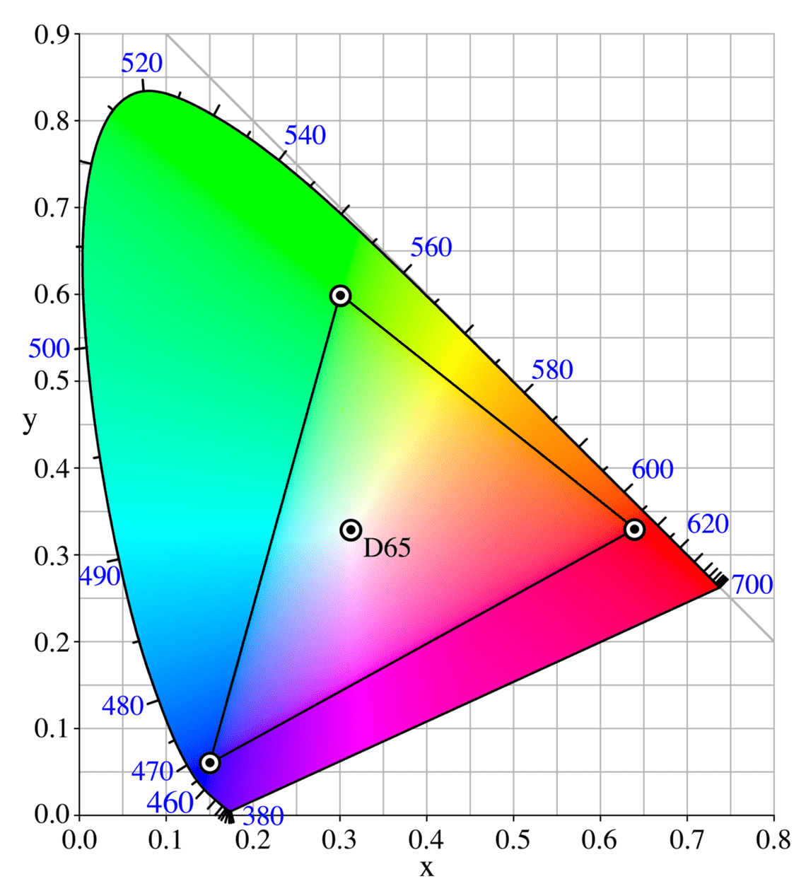
The diagram above shows the sRGB colour space. The triangle shows all the colours that sRGB is able to display. Now let us compare sRGB and Adobe RGB.
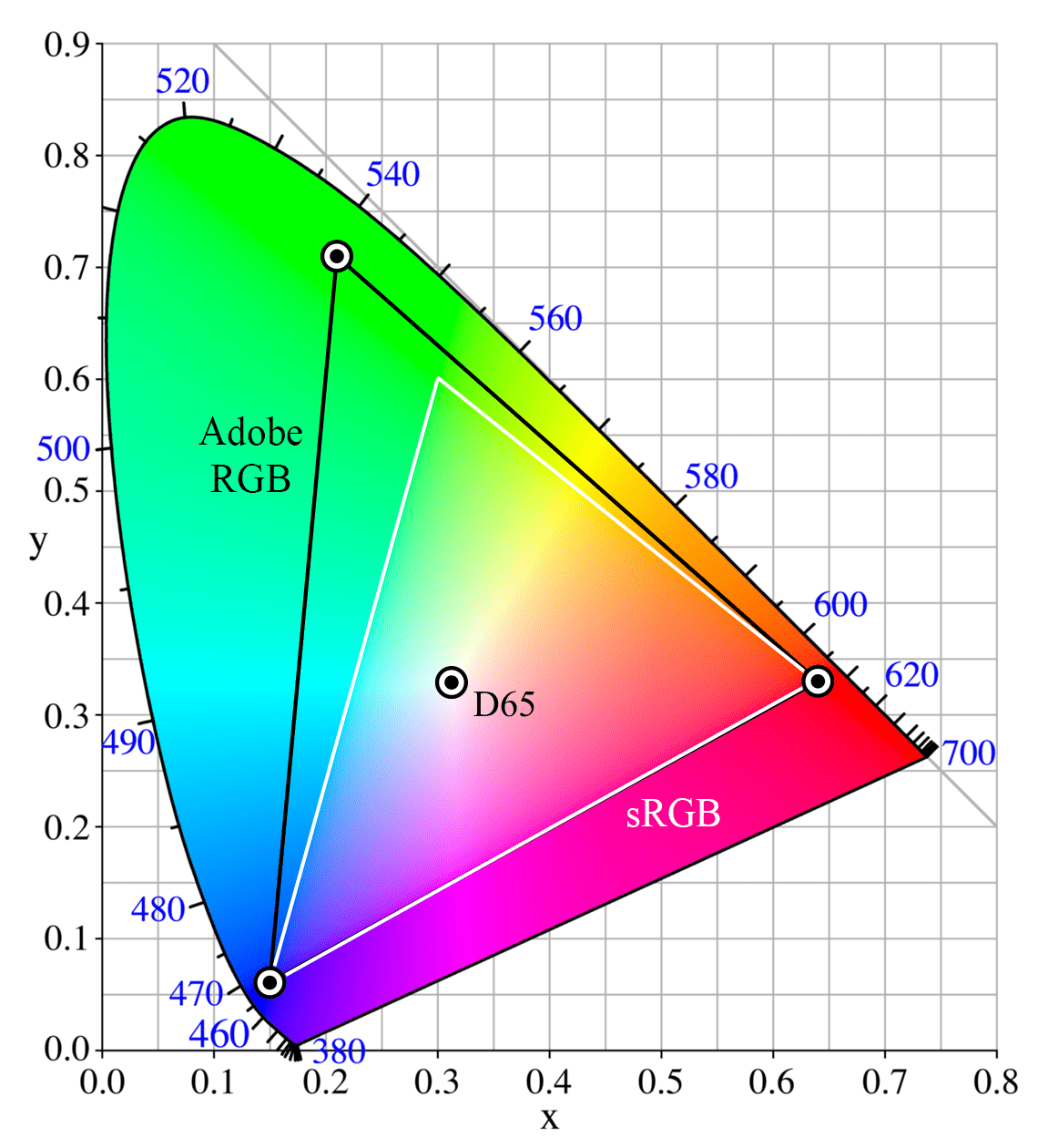
As you can see from the above image, the Adobe RGB colour space (black triangle) covers a wider amount of colours, particularly in the greens, than the sRGB colour space (white triangle).
Again, I want to point out that both colour spaces contain the same number of colours. It’s just that the colours in Adobe RGB are spread out more, so the difference between each colour is wider.
If a monitor or display can support a gamut wider than sRGB, then it is known as a wide gamut monitor. Wide gamut monitors tend to be more expensive than standard gamut monitors, and are primarily used by photographers, videographers, and graphic designers. If you’re shopping for one, see our guide to the best monitors for photo editing.
A standard monitor will normally support viewing sRGB, or at least, most of the sRGB gamut. When you read the monitor specifications, or reviews of the monitor, you should be able to find out how much of the sRGB gamut it covers.
A wide gamut monitor is designed specifically for content creation tasks where colour accuracy matters, such as photo and video editing. A wide gamut monitor will normally be able to display 100% of the Adobe RGB gamut, which contains 100% of sRGB.
At an absolute minimum, if you are in the market for a new monitor or laptop, make sure it can display 100% of the sRGB gamut. For professional use, I would recommend a wide gamut monitor, as long as you are willing to set it up properly.
Many high end laptops and even smartphones these days come with wide gamut screens, but always check before purchase if this is important to you.
Colour Profile
A colour profile takes two forms. First, a colour profile is associated with a display, and sets out what colours the display is capable of producing.
Second, a colour profile is associated with an image, and sets out the gamut range of that image, such as sRGB or Adobe RGB.
When you save an image, the colour profile is saved as part of it. This is so that when you open the image with an image viewer or a web browser, it knows what the colours should be.
When I mentioned earlier the concept of saving an image as an sRGB or an Adobe RGB image, this is done with a colour profile.
When saving an image, you can think of a colour profile a bit like a legend to a map. The map only makes sense if you know what the symbols mean, and the legend does that.
A colour profile only works if the application you are opening the image in supports colour management. This didn’t used to be the case, especially with web browsers. These days the majority of programs and software products do support colour management, including most web browsers such as Chrome and Safari.
However, some parts of operating systems such as Windows 11 still do not support colour management in their native apps. So parts of the interface may appear oversaturated on a wide gamut colour managed monitor, even after calibration.
This is because if an application doesn’t support colour management, then it will usually assume the image uses the standard sRGB profile. This can result in strange results on a wide gamut monitor.
The solution is to only use colour managed applications when using a wide gamut monitor, so the colours look right.
As mentioned at the start of this section, displays also have a colour profile, which indicates the range of colours that the monitor can display. Some monitors can only display the sRGB gamut, whilst others can display wider gamuts such as Adobe RGB.
The colour profile for the monitor is usually stored as a file, and referenced by your computer’s operating system or graphics card. It allows the computer to know what the monitor is capable of, and to output the correct information to the monitor so it displays the correct colours. Monitor colour profiles are usually saved as small files with the .ICC extension.
A monitor or display will come with a colour profile that your computer will use by default in most cases. Alternatively, the operating system you use will have a standard colour profile which it will use as a fall back.
A better solution to either of the above is to create your own ICC profile to match your monitor. You can do this either using software calibration tools, or by using a device known as a hardware colorimeter. More on this in the section below on how to calibrate your monitor.
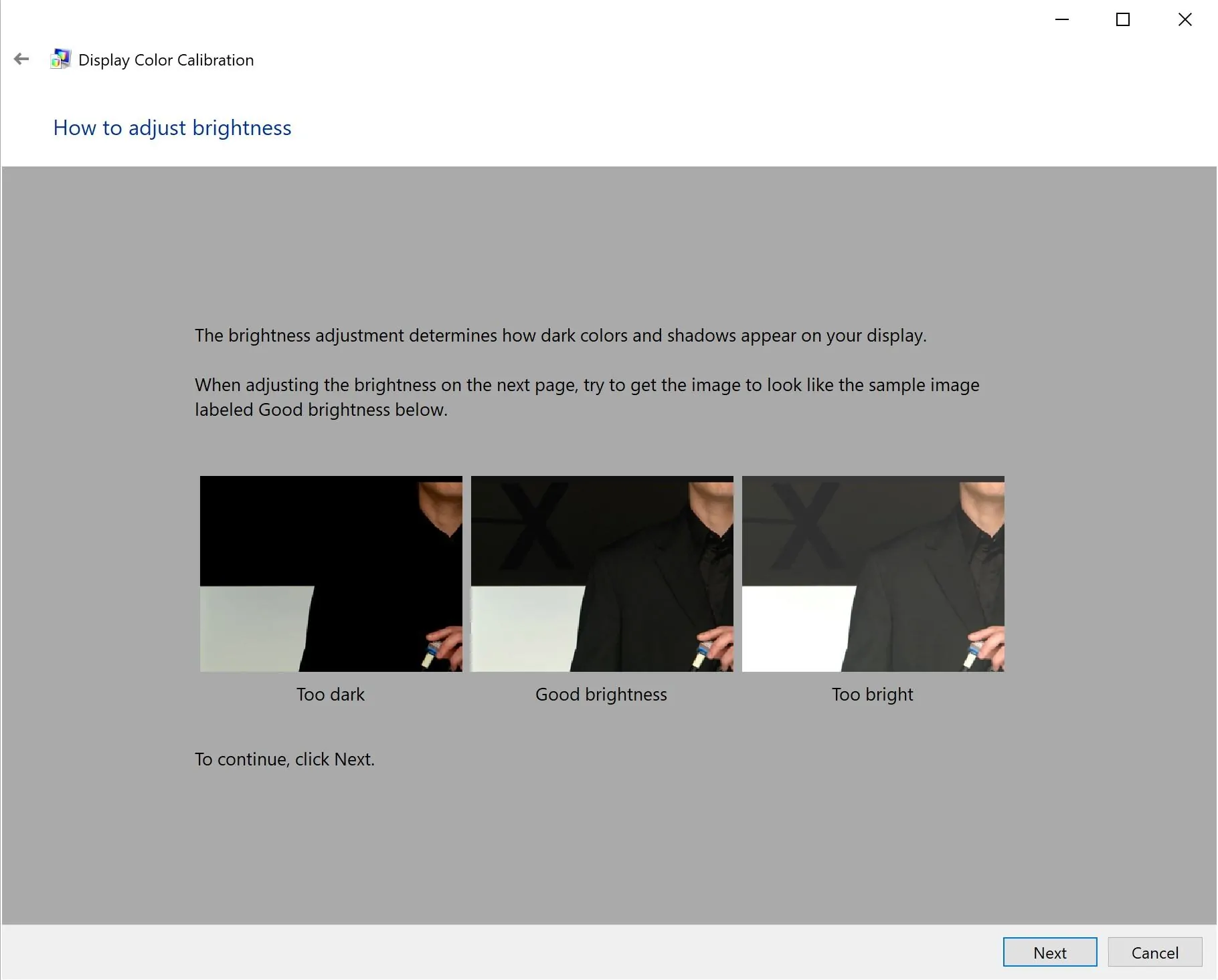
Brightness
OK, we’re onto the easier parts now. Most monitors and screens on the market have a brightness control, which lets you change the intensity of the light coming from the display.
Brightness, which can also be referred to as luminance, is measured in candela per square meter, or cd/m². Higher brightness results in more intense light, lower brightness results in less intense light. Usually, you will adjust the brightness depending on the overall lighting in your particular setting.
If you are trying to work somewhere with a lot of ambient light, you will likely need to increase the screen brightness so you can see the screen properly. This is because in a well lit environment your eyes adjust to the ambient brightness, and make the screen seem dark. So you have to increase the brightness.
If you are working somewhere darker, you can reduce the brightness.
The brightness of a screen affects how colours appear. In addition, if you edit your photos on a bright screen, you might incorrectly adjust the image brightness. The result is that your printed images come out too dark.
For photo editing, 120 cd/m² is the brightness value generally agreed upon in the photography industry as a good value when working on images you intend to print. This sits within the 80-120 cd/m² range that ISO standards for soft-proofing displays (ISO 12646) and print viewing conditions recommend under controlled lighting.
In reality, this brightness level is actually quite dim, and would require you to be editing your photos in a fairly low lit environment. This is the ideal, but is unfortunately not necessarily realistic for most users.
As a result, many users adjust their brightness to higher levels to suit the ambient light of their working environment. Just be aware that prints can turn out darker if your monitor is set to a high brightness level. For this reason, I recommend always doing proofs of your prints before the final version if you are selling prints of your work. For the web, as most users likely have quite a high brightness setting already, this will be less of an issue.
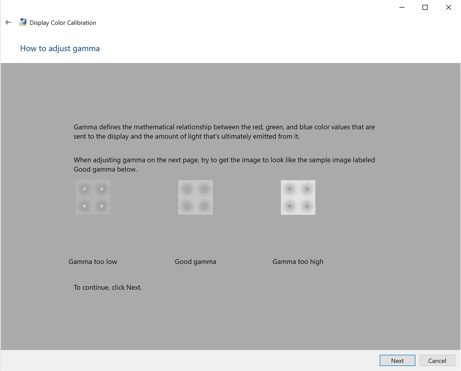
Gamma
When you adjust the brightness of a screen, it equally affects all the colours on the screen. This can result in black areas becoming grey and washed out, which is undesirable. Decreasing the brightness has the opposite effect: blacks become more black, but white starts to become grey.
Gamma is a different way to adjust the perceived brightness. When you increase the gamma, it lightens the lighter shades more than the darker shades. So blacks stay black, but white becomes lighter. Instead of a uniform change to the overall image, the change is applied as a curve.
Brightness and gamma controls are independent of each other. Whilst most monitors have a brightness control, few have gamma controls. However, you can usually control gamma via your computer, and this is usually done with a software or hardware calibration tool. More on this in the section on calibrating your monitor.
Saturation
Saturation is a control that many devices and displays offer, and it affects how colours look. Increasing the saturation results in colours appearing more intense, whereas lowering saturation results in colours appearing duller.
When calibrating a monitor, it’s important that the saturation levels are set correctly so images appear as they should. If you have your monitor saturation set too high, then you will create images that might appear dull when you print them or share them on the web.
White Point
Earlier, we mentioned how in RGB, white corresponds to RGB (255, 255, 255). The three channels are combined at their maximum values to create white.
There are different versions of “white”. This is because how we perceive white varies depending on the lighting conditions. Our brains adapt and adjust what we see as white, depending on these conditions.
For example, imagine you have a white piece of paper. If you hold this outside in the midday light, your brain will perceive it as white. If you were then to come inside and view it under indoor lighting conditions, which vary dramatically, your brain would adjust so it still appears “white”. In reality, it’s likely one of a variety of whites, ranging from a warmer, yellowish white, through to a cooler, blueish white.
If you’ve ever bought a light bulb, you will have noticed that they come in a huge variety of “white” colours. These are basically different white points.
When calibrating a monitor, you can choose a white point. This will let you choose what sort of white you want, from a warmer yellow white tone through to a cooler blue white tone. The white tone will vary depending on your surroundings. If you are working in an environment with cooler lighting, you will want a cooler white point, as otherwise your screen might appear too yellow to your eyes.
Conversely, if you have more warm lights in your working environment, you will want a warmer white point, as otherwise the screen may appear too blue to your eyes.
The white point is defined as a number, measured in K, or Kelvin. This actually refers to a temperature. If you’re wondering why, see this article. A warm white point would be 5,000K or lower, whilst a cool white point would be 6,500K or higher. Daylight is generally measured at 5,500K.
For photo editing, a white point of between 5,000K and 6,500K will usually work best, depending on your monitor and ambient lighting conditions. Most calibration tools will recommend 6,500K, which is the standard if you are working in perfect conditions. However, I find that this makes my monitor look too blue, so I personally use 5,000K.
How to Calibrate Your Monitor for Accurate Colours
OK, we’ve done the terminology. Hopefully it all made sense or you at least have a general idea of some of the reasons why monitor calibration is important. Let’s now look at how to actually calibrate your screen.
If you are using a laptop or desktop with an external screen, you have two main options for calibrating it: use the software that the OS comes with, or use a hardware device known as a colorimeter.
If you have a smartphone or tablet, most of these don’t allow for complex colour calibration, although they might let you adjust saturation and other features. My advice would be to properly calibrate your monitor first, and then adjust any settings on your smartphone you can to make images look similar.
Software Monitor Calibration
If you have a Mac or Windows PC, you can use the built in software to calibrate your monitor. The process is similar for both platforms. Basically you launch the colour management tool on each platform, and will be taken through a number of screens where you can calibrate your monitor.
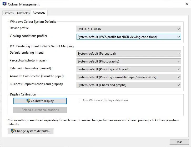
On Windows 11, type “Color Management” into the start menu, then click the “Advanced” tab and “Calibrate Display” under “Display Calibration”. The legacy calibration wizard is what we’ll walk through below; the screenshots are from an older Windows build, but the layout has barely changed since Windows 7. Windows 11 also has a separate HDR Calibration app if your monitor is HDR-capable (this is a free download from the Microsoft Store, distinct from the legacy wizard). HDR calibration is covered in its own section below.
On Mac, go to System Settings → Displays, click your display, then click the Colour Profile dropdown and choose “Customise”. This gives you the standard profile picker. If you want the proper photographer-grade controls (white point picker, gamma slider, three-step calibration), there’s a hidden Expert mode: hold the Option key while clicking “Customise” and you’ll get the Display Calibrator Assistant in its full form. Apple has hidden this behind the Option-click for years and it isn’t documented anywhere obvious, so this is the trick worth knowing.
I will walk you through what this looks like on Windows with some screenshots to give you an idea. The process is very similar on an Apple device.
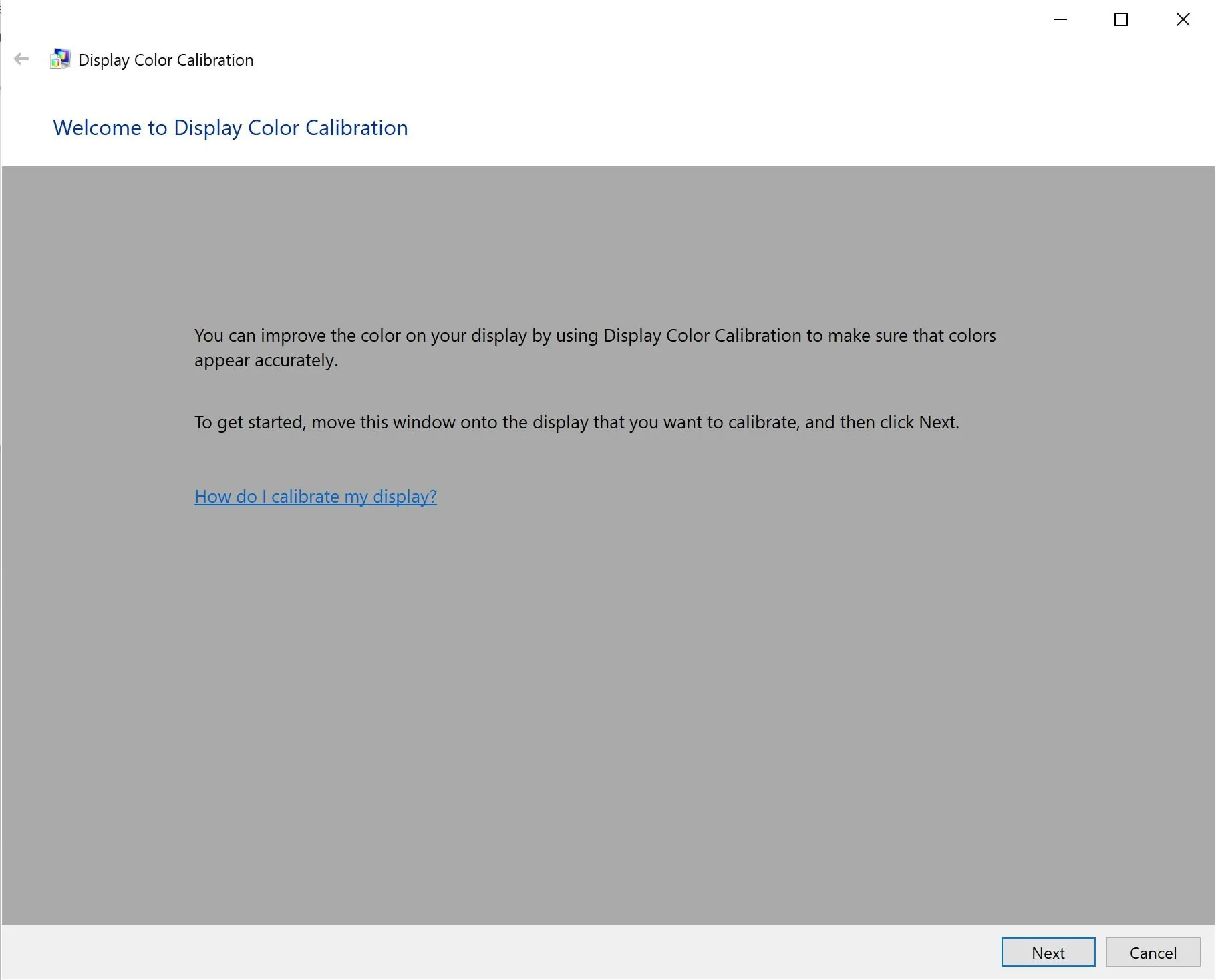
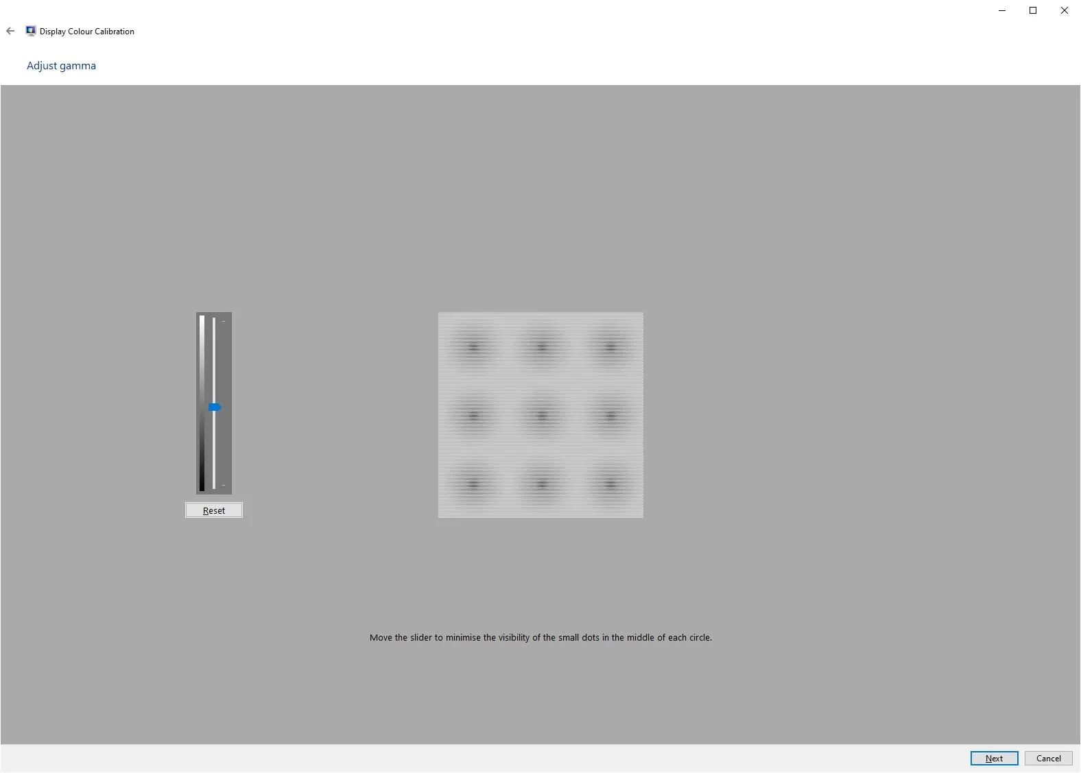
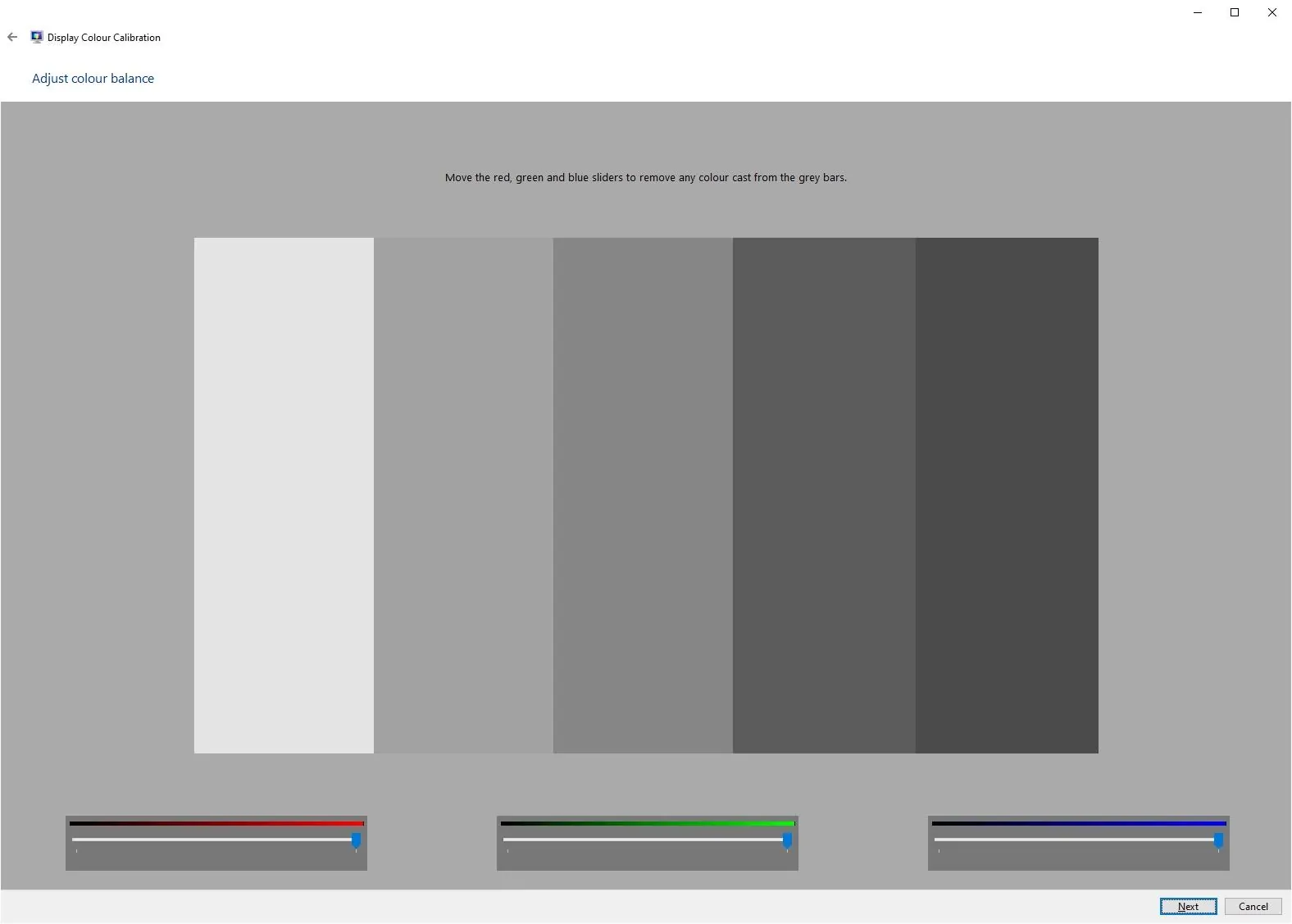
As you can see, when you go through the process, the program tells you what to look for, and you then make adjustments using either sliders in the app, or the on-screen controls your monitor offers.
When you get to the end of the process, you will be able to compare the original calibration and the new calibration, and then to save and apply the calibration.

Using your computer’s built in calibration is an easy way to calibrate your monitor and it’s also free.
However, there are some serious downsides to calibrating your monitor this way. The major issue is that you are relying on your eyes to calibrate the colours on your monitor.
As we’ve already covered, our eyes are very clever, and are able to adjust to the ambient lighting around us. However, this also means that they can’t be relied on for creating accurate colour profiles. If you’ve been sitting in an area of cooler light for a time, your monitor calibration will look different compared to if you are sitting in warmer light.
There’s also a free, open-source alternative for serious-amateur users: DisplayCAL (a frontend for the ArgyllCMS calibration library). DisplayCAL is hardware-driven (it uses a colorimeter, not your eyes), but it’s free where Spyder and Calibrite’s own software is bundled with the hardware purchase. If you already own an older colorimeter and the manufacturer software has stopped supporting it, DisplayCAL can often keep it working for several more years. It’s not for the faint of heart (the UI is dense and the documentation assumes a lot), but it’s the most powerful free option going.
So whilst software calibration is better than no calibration at all, if you plan on doing any serious photo editing with your display, you will want to consider a hardware calibration tool instead.
Hardware Monitor Calibration
If you are serious about getting the right colours on your display, then a hardware calibration device, known as a colorimeter, is the best option.
These are physical devices which actually measure the light that your display emits. Unlike the human eye, they don’t change what they see based on the ambient light. So you know that when they measure a white point or any other colour, the result is accurate.
Most monitors require the use of an external hardware colorimeter, but some very high-end monitors for photo editing have them built-in.
For this article, I’ll be using my Datacolor Spyder X Pro to walk you through what a hardware calibration session actually looks like. This is the unit I’ve been using since 2020. The model has since been superseded (the current Datacolor line is the SpyderExpress, Spyder, and SpyderPro, with the older Spyder X Pro still available from Datacolor for existing users). The principles are the same across the range, it’s just the newer models support newer display technologies. For example, the 2024 generation added proper OLED and HDR support. If you’re buying today, my pick is the SpyderPro. If you already own a Spyder X Pro, it still works for SDR monitors.
The principle for using any of them is the same.
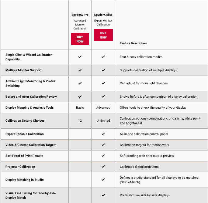
When I bought my Spyder X Pro, it came as a Pro and an Elite version. I had the Pro. They do pretty much the same thing, the Elite just had a few extra features in the software, such as side-by-side monitor matching. You can see the original feature comparison in the table below:
The Spyder X Pro was the first colorimeter from Datacolor that worked using a lens, rather than a light sensor. This meant it could do the calibration much faster than previous models. The previous version, the Spyder 5, took around five minutes to measure and calibrate a display. This model takes closer to 90 seconds. The current SpyderPro is also a 90-second-class device.
This might not seem huge, but if you have a number of displays to calibrate, it adds up. In addition, monitor calibration is a task that should be repeated at least once a month, as monitors tend to shift their colours over time. So if it takes less time, you are more likely to do it.
OK, on to using a hardware colorimeter. The Spyder, regardless of model, comes in a box which consists of the device and a piece of paper with the license code, and instructions for where to download the software. In the old days, the software would have come on a CD, but not everyone has those drives any more.
It might have been nice to have a USB drive with the software on it. Doing an online download means you definitely get the latest version of the software. The download is only around 180MB, so it won’t take much time, even on slower connections.
The software works with both Windows and macOS, and just requires a standard sized USB port on your computer.

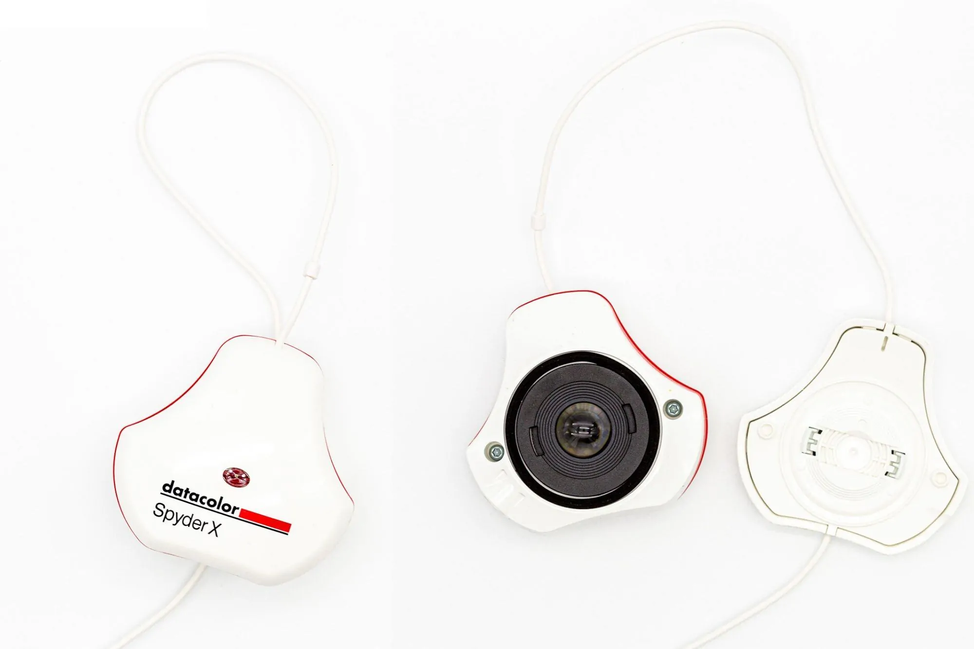
The device itself is a neat little tool which comes in two parts. These clip together, and the lens is inside the device and protected when clipped together.
For use, you unclip the two parts, and hook the part with the lens over your display, and the “cover” counterbalances it.
The two parts are connected by a USB cable which can be adjusted, and which plugs into a free USB port on your computer.
Using the software is very easy, even if you are not a colour management expert. Which, honestly, most of us are not. When you first run it, it will walk you through a checklist to ensure you have the right conditions for monitor calibration.
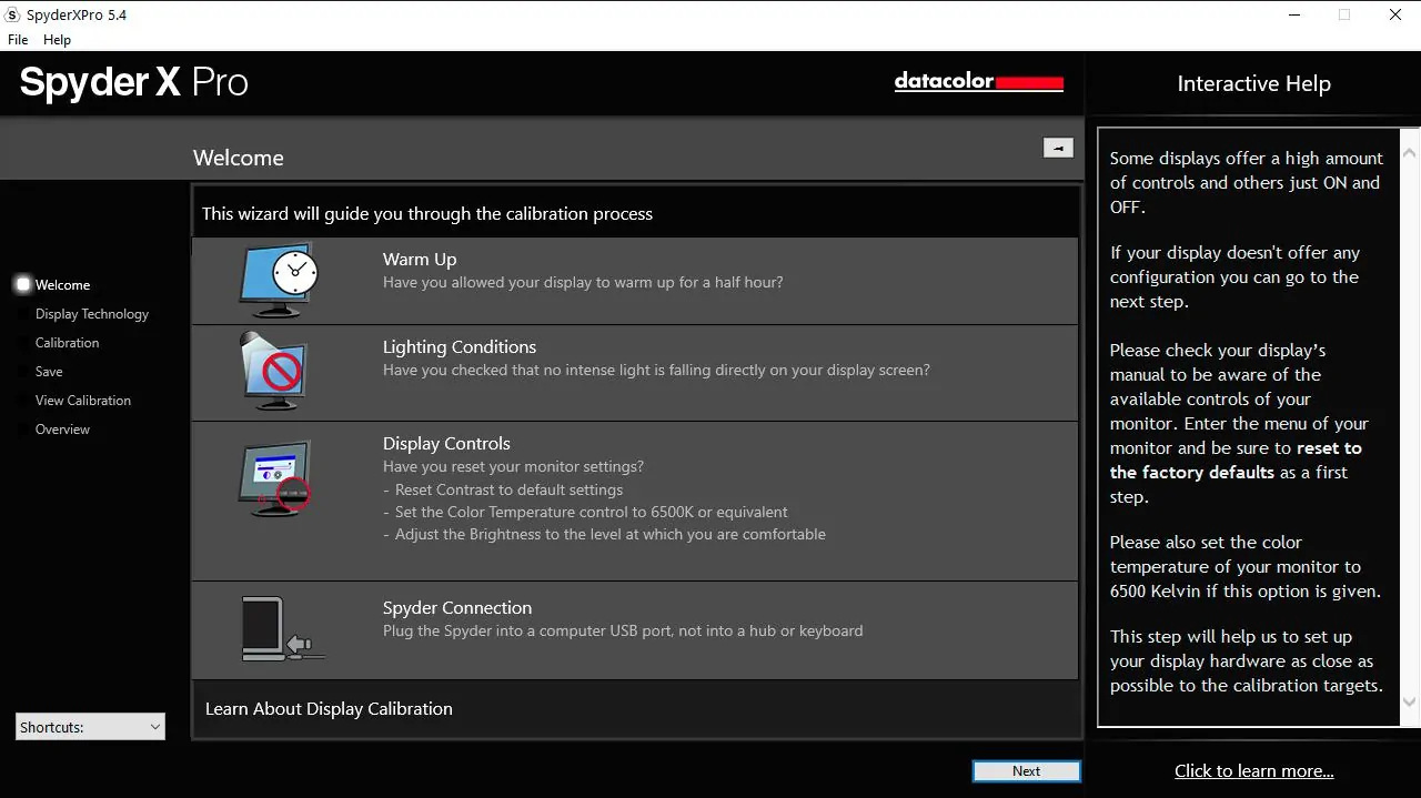
You have to confirm that you have warmed the monitor up for at least 30 minutes, that there is no light falling onto the screen, and that you have reset your display to the default settings.
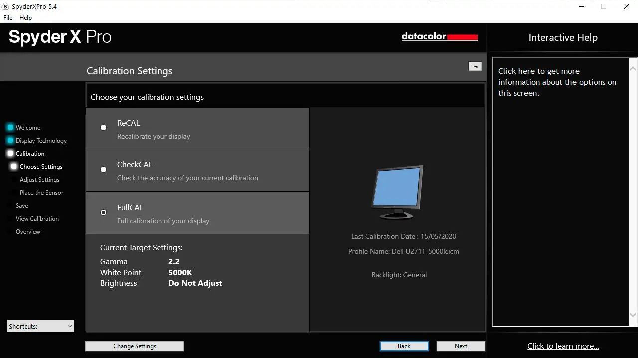
Then, you will go through a number of settings specific to your setup. It will ask you questions about the type of display you have, and then give you the options to recalibrate a display, check your display accuracy, or do a full calibration.
If this is your first time, you will want to do a full calibration. It will show you the target settings, based on your screen, that it is aiming for in terms of brightness, gamma, and white point. You can manually adjust these options if you want, but for the first run I would advise leaving the default settings.
There is another feature that is quite neat, which is the room light setting. In an ideal world, we would be editing all our photos in a fairly low light environment. This means that we don’t need to crank up the display brightness. Setting a high display brightness means images look brighter when editing than they might actually be, and is a common reason that prints look darker than the image on screen.
Of course, we don’t all happen to have a photo editing dungeon, and Datacolor has factored this in. The Spyder range has an ambient light sensor, so it can detect how much light there is in your environment. It can use this during calibration, and also to adjust the brightness of your screen on a daily basis as light levels change in your room.
Whether or not you find this useful is up to you. If you are in a working environment with fairly constant lighting, this may not be needed. However, if you have a working space which is well lit during the day, and darker at night, then this will come in useful.
You can configure whether or not the device sets up monitor profiles for different ambient lighting conditions in the calibration settings, under the Room Light and Brightness settings.
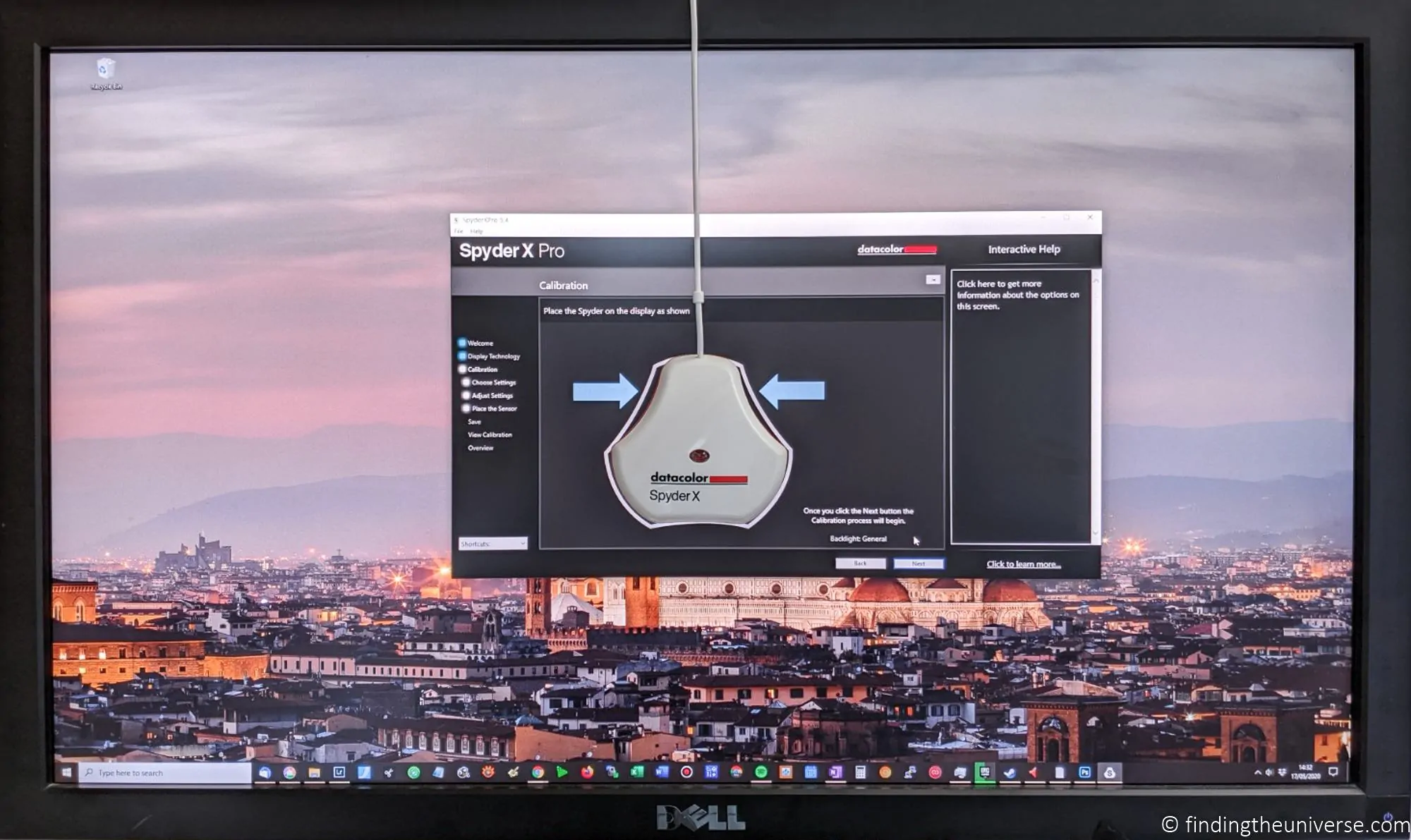
Once you have everything set, the tool will place itself in the centre of the screen, and show you where to place the Spyder. A tip: the Spyder needs to be flat against the screen, not dangling. If you have an external monitor, you will likely need to tip it back a bit to get the Spyder to lie flat. A laptop screen is a lot easier to work with as it tilts easily.

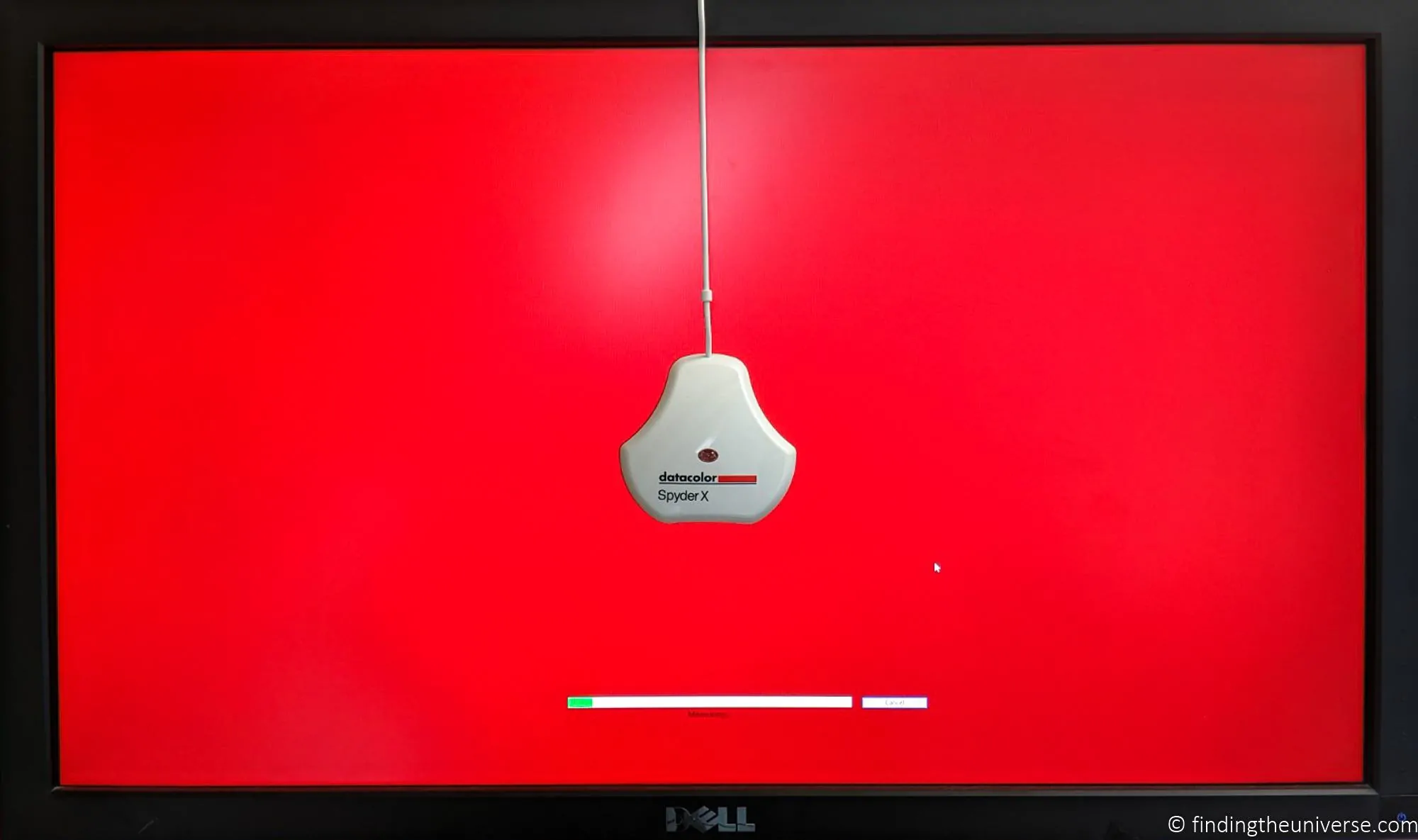
Once you have the Spyder placed, you can start the calibration process. This is quite hands off, with the exception that you will be prompted to adjust the brightness. Otherwise, it just flashes pretty colours.
When it is done, it changes the colour profile your computer uses and lets you set a name for it. It also shows some example images you can use to see how the profiling turned out. At this point you will have the option to toggle a before and after version of your screen calibration, and use the test image provided to see the difference.
At this point in the calibration, the screen may appear to be more blue or more yellow than you are used to. This is not unusual. If you have been using a poorly calibrated monitor, your eyes will have adjusted to this as normal.
However, ambient light and other factors can also affect how you perceive white, and it will be a jarring experience if you work in a warmly lit room yet have your monitor set to a cool colour. Personally, I have this situation, and I found the default 6,500K to be too blue for my personal setup. So I ran through the calibration again, with a target white point of 5,000K. This gave an excellent result for my setup and situation.
Another thing you might notice after calibration is that colours in colour managed applications are a little more muted than you are used to. Many monitors and displays ship with relatively high levels of saturation, which is not realistic.
Once you have things where you want them to be, you can check how your monitor performs in a number of tests, including what gamut it is capable of displaying. Ideally you want it to be around 100% of sRGB at a minimum. If you have a wide gamut monitor, you want it to be over 100% of sRGB, and covering more of the Adobe RGB gamut.
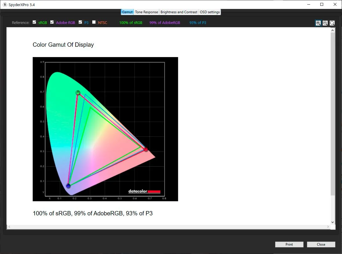
As you can see, after calibration, the monitor I am using achieves 100% of sRGB and close to 100% Adobe RGB.
I found the Spyder X Pro to be an excellent bit of kit that finally let me properly adjust my monitor for accurate colours. It’s easy to use, and I like that it has the room light monitoring feature, meaning it stays useful even in between calibration sessions.
If you are looking to calibrate your monitor today, the current pick from Datacolor is the SpyderPro, which is available direct from Datacolor here. The equivalent from Calibrite is the ColorChecker Display Pro (or the Display Pro HL if your monitor is HDR-capable). Either is a fast and easy to use solution if you want your prints to match your screen.
Calibration Test Image
Once you’ve calibrated your monitor, you’ll want to verify the calibration worked. The check that matters most for photographers is whether the monitor can show you what your photos actually look like across the full tonal range. A target chart is the way to do that.
Below is a calibration test image I’ve put together specifically for photographers. Open it on your monitor at full screen (press F11 in most browsers) and check it against the criteria below. Don’t trust your phone screen or your laptop’s web display to check the same image on a different monitor: each panel will give a slightly different result, which is the entire point of calibration.
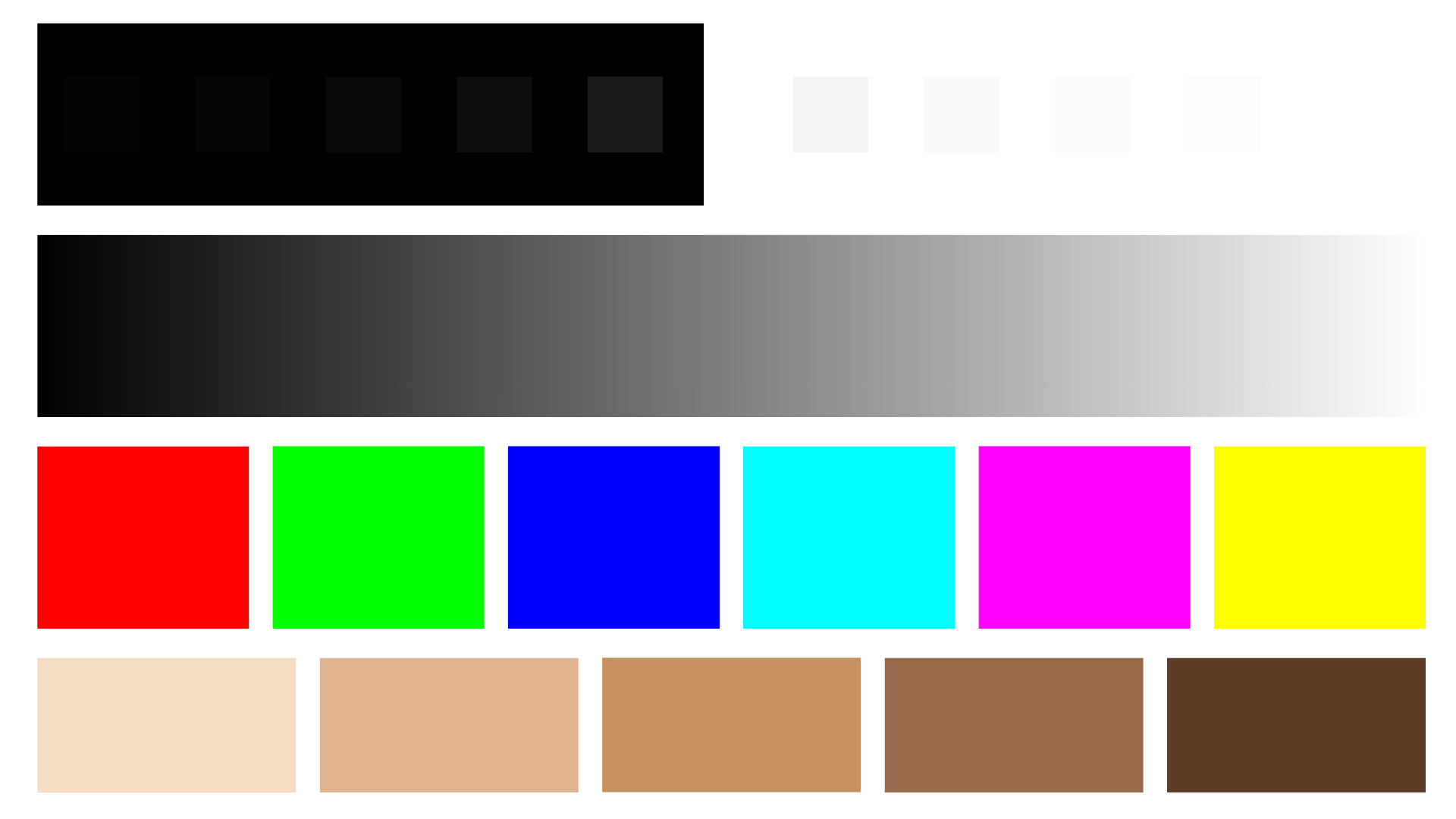
What to look for
- Black-point step wedge. The first row shows grey patches at 1%, 2%, 3%, 5%, and 10% lightness against pure black. You should see five distinct patches, each clearly separable from the one next to it and from the black background. If the first two patches blend into the black, your monitor is crushing shadows and your dark detail won’t be trustworthy. Either raise your monitor’s brightness, lower its contrast, or recalibrate.
- White-point step wedge. The second row shows the equivalent at the bright end, with patches at 245, 250, 252, 253, and 255 against pure white. You should see all five steps cleanly. If 252 and 253 merge into white, your highlights are being clipped and bright detail is being lost. Drop the brightness or recalibrate.
- Neutral grey ramp. The continuous grey gradient should be neutral all the way along, with no colour cast. If you see green tints in the shadows or magenta in the highlights, your white point is off or your monitor has a panel issue calibration can’t fully fix.
- Primary and secondary colour patches. The colour grid shows pure sRGB-targeted reds, greens, blues, cyans, magentas, and yellows. Reds should look red (not orange-shifted), blues should look blue (not violet), and greens should look green (not yellow-green). These are the colours your monitor most likely gets wrong.
- Skin tone references. The skin tone row covers a range of skin tones from light to deep. These should look natural rather than orange, pink, or grey. Skin tones are the hardest test for a monitor because the eye is exceptionally sensitive to skin-tone shifts.
- One percent grey gradient. The final block is a near-imperceptible grey gradient with 1% steps. On a properly calibrated wide-gamut monitor you should be able to make out the steps if you look closely. On an SDR monitor you will see fewer distinct steps. If the whole block looks uniform, your monitor is averaging too aggressively and you will lose subtle gradients in your photos (skies, smooth water, soft skin).
If most of the checks pass and only one or two fail, you can usually fix it by recalibrating with adjusted settings (lower brightness, different white point). If most of the checks fail, either the calibration didn’t run correctly, or the monitor isn’t capable of accurate colour at all. The latter is rare on monitors sold in the last five years, but it does happen on cheap panels and very old IPS displays.
This image is also useful in print. Print it on the paper you usually use, with the same printer and the same profile, and check the same criteria on the physical print. If the print version shows fewer distinct steps than the on-screen version (which it usually will), that gap is your monitor-to-print gap, and is what print proofing is meant to reveal.
Calibrating an HDR Display
Most photographers have ignored HDR until quite recently, because the editing software didn’t really support it. That has changed. Lightroom now has a working HDR editing workflow (introduced as a preview in 2023 and refined since), and a lot of new monitors support HDR, with several photographer-targeted picks in our best monitors for photo editing guide covering HDR. So HDR calibration is becoming relevant.
A few things to know.
First, HDR mode on Windows essentially bypasses your SDR ICC profile. When you turn on HDR mode in Windows display settings, the operating system stops applying the colour profile your colorimeter generated for SDR use. This means that an HDR monitor in HDR mode needs its own calibration pass, separate from the SDR one. The way to do this on Windows 11 is via the free HDR Calibration app from the Microsoft Store. It’s a separate tool from the legacy calibration wizard.
Second, not every colorimeter handles HDR brightness well. The older Spyder X Pro and the older Calibrite ColorChecker Display Pro hit their measurement ceiling around 1,000 cd/m², and many HDR monitors push to 1,500-4,000 cd/m² in HDR mode. Above the colorimeter’s ceiling, the readings are unreliable and your HDR calibration will be off. The 2024-onwards generation (Datacolor SpyderPro, Calibrite Display Pro HL) handle high-luminance displays properly, and are the picks for HDR work.
Third, the practical answer: if you’re not actively editing for HDR delivery, you don’t need to calibrate in HDR mode. Most photo prints are SDR. Most websites display SDR. Most clients view photos in SDR. If your monitor is HDR-capable but you’re producing SDR output, leave HDR mode off during editing sessions and use your normal SDR calibration. HDR mode is for when you’re producing HDR output, which today means Lightroom’s HDR-encoded JPEG XL or AVIF files, or video work.
If you are doing HDR editing, calibrate twice: once for SDR (your day-to-day work), once for HDR (your HDR-specific sessions). The colour profiles are stored separately by the operating system and switching modes loads the right one.
Frequently Asked Questions
Do I need to calibrate my monitor for photo editing?
If you print your photos, sell prints, or want consistent colour between your screen and your output, yes. If you only share photos to the web, you can probably get by with software calibration plus a careful setup, but a hardware colorimeter still gives you a meaningful improvement. The diagnostic section earlier in this guide can help you decide.
How often should I recalibrate my monitor?
Once a month is a reasonable rhythm for serious work. Monitors drift over time, mostly due to backlight ageing and ambient temperature changes, so a calibration from six months ago is no longer accurate. Some calibration software (the Spyder range, for example) will prompt you when it thinks a recalibration is due. If you’ve just bought a new monitor, calibrate immediately and then again after the first month (panels often need a settling-in period).
Is software calibration good enough?
For casual use, yes. For serious photo editing, no. Software calibration relies on your eyes to judge colour, and your eyes adapt to ambient light. So a calibration done in cool morning light will give a different result from the same calibration done under warm evening light. A hardware colorimeter doesn’t have that problem because it actually measures the light coming off the screen.
Calibrite or Datacolor: which is better for photographers?
They are roughly equivalent for photography use. The Datacolor SpyderPro and the Calibrite Display Pro HL are the two top photographer picks in 2026, both handle modern HDR and OLED displays, and both produce accurate calibrations. Datacolor’s StudioMatch feature is purpose-built for matching multiple monitors and is the differentiator if you have several displays. Calibrite is the rebranded successor to X-Rite ColorChecker, so if you’ve used older X-Rite gear or seen older articles recommending an X-Rite i1Display, the modern equivalent is Calibrite. Pick whichever is easier to get hold of.
What if Windows 11 warns that the built-in calibration tool won’t work with my wide gamut monitor?
This is a known issue. Windows 11’s built-in Calibrate Display wizard wasn’t designed for wide gamut monitors and warns you accordingly. The wizard will still run, but the results won’t be accurate. You have two options. Either install a generic ICC profile if your monitor manufacturer supplies one (often available as a download from the monitor’s product support page), or buy a hardware colorimeter and use the manufacturer software (Datacolor’s or Calibrite’s), which handles wide gamut displays properly. A generic ICC profile is better than nothing, but is a one-size-fits-all calibration for the model, not for your specific unit.
Which monitor picture mode should I calibrate?
If your monitor has multiple modes (sRGB, Adobe RGB, DCI-P3, Rec. 709, Standard, etc.), calibrate the one you intend to actually use. For most photographers, that’s the Adobe RGB mode if you have a wide gamut monitor and edit for print, or the sRGB mode if your work is web-only. If you want to use multiple modes, you’d need to calibrate each one and switch between profiles in your operating system. Some monitors have profile-switching baked in (BenQ and ASUS ProArt models, for example), which makes this easier. If the sRGB mode is locked on your monitor (a frustration on some ASUS models), calibrate one of the unlocked modes that covers your working colour space.
Further Reading
Hopefully this post answered most of your monitor calibration questions. Before you head off, I wanted to share some more photography tips and advice that I’ve put together over the years of running this site.
- Obviously you will need a monitor to calibrate. If you are in the market for a new monitor, see our guide to the best monitors for photo editing.
- We have a guide to how to use a compact camera, how to use a DSLR camera, and how to use a mirrorless camera. We also have a guide to how a DSLR works.
- Knowing how to compose a great photo is a key photography skill. See our guide to composition in photography for lots of tips on this subject.
- We have a guide to what depth of field is and when you would want to use it.
- We are big fans of getting the most out of your digital photo files, and to do that you will need to shoot in RAW. See our guide to RAW in photography to understand what RAW is, and why you should switch to RAW as soon as you can if your camera supports it.
- We have a guide to the best photo editing software, as well as a guide to the best laptops for photo editing for some tips on what to look for.
- If you’re looking for more advice on specific tips for different scenarios, we also have you covered. See our guide to Northern Lights photography, long exposure photography, fireworks photography, tips for taking photos of stars, and cold weather photography.
- If you’re looking for a great gift for a photography loving friend or family member (or yourself), take a look at our photography gift guide.
- If you’re in the market for a new camera, we have a detailed guide to the best travel cameras, as well as specific guides for the best cameras for hiking and backpacking, the best compact cameras, best mirrorless cameras and best DSLR cameras. We also have a guide to the best camera lenses.
- If you want a camera or lens, but the prices are a bit high, see our guide to where to buy used cameras and camera gear for some budget savings options.
- We have a guide to why you need a tripod, a guide to choosing a travel tripod, and a round-up of the best travel tripods.
Looking to Improve Your Photography?
If you found this post helpful, and you want to improve your photography overall, you might want to check out my online travel photography course.
Since launching the course in 2016, I’ve already helped over 2,500 students learn how to take better photos. The course covers pretty much everything you need to know, from the basics of how a camera works, through to composition, light, and photo editing.
It also covers more advanced topics, including astrophotography, long exposure photography, flash photography, and HDR photography.
You get feedback from me as you progress through assignments, access to webinars, interviews and videos, as well as exclusive membership of a Facebook group where you can get feedback on your work and take part in regular fun photo challenges.
It’s available for an amazing one-off price for lifetime access. You can check it out by clicking here.
And that’s it for our guide to monitor calibration. If you have any questions or feedback, I’m here to listen and do my best to answer. Just pop them in the comments below and I’ll get back to you as soon as I can.
Bournes Mouth says
Hello. I am new to monitor/color calibration and I just bought a wide gamut monitor. However, when I go to the Color Calibration tool in Windows 11, I get a popup warning that the tool will NOT account for the wide gamut and will probably not look good. Is there a software tool that you recommend that will work? Is downloading an ICC profile an alternative to monitor calibration? Thanks!
Laurence Norah says
Hi Bournes,
Yes, downloading an ICC profile is similar to calibration, however it will just be a generic calibration rather than one that is specific to your exact monitor. Ideally you need to calibrate your monitor based on it’s specific hardware. The only way to really accurately do this is with a hardware tool, as our eyes are not really reliable enough for accurate calibration. So that would honestly be the best option, otherwise I’d say an ICC profile might be the next best option.
Laurence
Zack says
Hi! Thank you for your article! The one thing I can’t find anywhere, and I’m sorry if I missed this, is what picture mode do I calibrate? The sRGB I cannot adjust, it’s locked in. I also have Adobe rgb that can be adjusted, rec 709, dcip3, standard etc
Which mode do I run calibration on? What if I want to work in multiple color spaces? I have an ASUS PA329c
Thank you!
Laurence Norah says
Hey Zack,
It’s my pleasure! So there’s a good guide here to calibrating your specific monitor from Asus:
https://www.asus.com/us/support/FAQ/1042443/
I’d suggest calibrating in the color space you are most likely to want to work in. So that might be Adobe RGB for example. If you want to work in multiple color spaces then you would need to calibrate for each one. I’m not sure if the monitor supports that, otherwise you’d have to use something like Spyder’s utility software to set up multiple display profiles and then switch between them.
Good luck!
Laurence
Shel Erb says
This is really great and helpful! However, if I have photos that were previously under an uncalibrated view and have since recalibrated the monitor, how would one change those prior photos to become calibrated if it “appears” like a normal image on the screen? Trying to modify previous images that when printed out appear with a with a green tint. Thanks!
Laurence Norah says
Hi Shel,
So there are a few things that could be happening here. First, an image can have a color profile embedded into it, so it might look different depending on if the application you are using to view the image is loading the color profile correctly. If you have Photoshop, you can assign different color profiles to an image (Edit -> assign profile). There’s also the consideration of the printer color profile, which is something you can also load up.
It sounds to me like you have calibrated your monitor and the calibrated profile is loaded, and when you view the image it looks correct now, but when you print it it is coming out green. To me that sounds like either an incorrect embedded color profile in the image which might be throwing the printer off. So trying to identify that first would be my first step.
Let me know if I can help any more!
Laurence
Marco says
Thanks for great article and content!
Laurence Norah says
My pleasure Marco!